Tony Manfredonia
Tony Manfredonia, a remarkably skilled composer and orchestrator was seeking not just a logo, brand identity, and website, but also a visual representation as diverse as his music catalog. From concert hall symphonies to indie rock solo albums, Tony's multifaceted talents required a look and feel that could harmonize with the richness of his musical repertoire.
-
Music
-
Logo • Branding • Web Design
-
2022


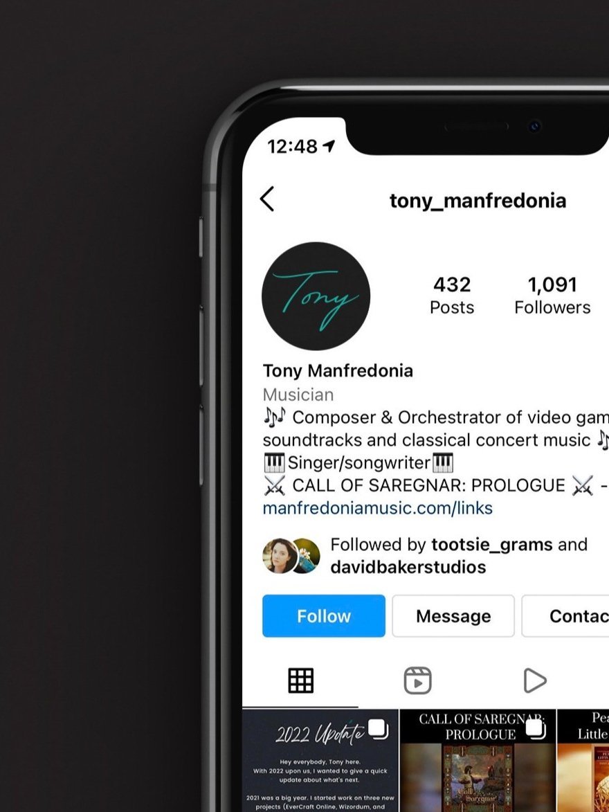
Tony boasts a signature fashion style for many occasions: a black suit and teal tie. Inspired by this, I crafted a unique tie design, doubling as an abstract 'T,' seamlessly integrated into a secondary logo lockup optimized for 1:1 ratio dimensions. To offer Tony maximum flexibility, I devised four distinct logo styles, allowing him to showcase his personality using just 'Tony' on social channels or opt for a more formal approach by incorporating his full name and tagline on business-related assets like business cards.


While I found great talent in all of his work, his most personal project, an album titled Rose Water, captivated me. The center of the logo’s A’s curved to the left, while “Tony” curves to the right to create a sense of movement that could coexist with an album full of transitions, like waves, that glide so smoothly.
You can view the whole website design here.

“Megan’s work blew me away. She put in a tremendous amount of energy researching who I am as an online brand. The result is brilliant—her logo is a perfect representation of who I am. She is personable, transparent, thoughtful, and unbelievably efficient at what she does. I highly recommend Megan!”